The two charts below show the same data using the same type of chart – guinea pig tooth growth data visualised on a horizontal bar chart. However, the clarity of the two charts is distinctly different. The choice of colours, addition of text annotations, change of font size, and more informative labels make the chart on the right-hand side much easier to interpret.1 In this section, we’ll explore each of these elements in detail, and discuss how to style different elements of charts to improve accessibility and interpretability of your data visualisations.
Code
library(ggplot2)library(dplyr)library(ggtext)plot_data <- ToothGrowth %>%mutate(dose =factor(dose)) %>%group_by(dose, supp) %>%summarise(len =mean(len)) %>%ungroup()# Unstyled plotggplot(data = plot_data,mapping =aes(x = len, y = dose, fill = supp)) +geom_col(position ="dodge")# Styled plotggplot(data = plot_data,mapping =aes(x = len, y = dose, fill = supp)) +geom_col(position =position_dodge(width =0.7),width =0.7 ) +scale_x_continuous(limits =c(0, 30),name ="Tooth length" ) +geom_text(mapping =aes(label =round(len, 0)),position =position_dodge(width =0.7),hjust =1.5,size =6,fontface ="bold",colour ="white" ) +scale_fill_manual(values =c("#9B1D20", "#3D5A80")) +labs(title ="Tooth Growth",subtitle ="Each of 60 guinea pigs received one of three dose levels of vitamin C (0.5, 1, and 2 mg/day) by one of two delivery methods: <span style='color: #9B1D20'>**orange juice**</span> or <span style='color: #3D5A80'>**ascorbic acid**</span>.",y ="Dosage (mg/day)" ) +theme_minimal(base_size =14) +theme(legend.position ="none",plot.title =element_textbox_simple(face ="bold"),plot.subtitle =element_textbox_simple(margin =margin(t =10),lineheight =1.5 ),plot.title.position ="plot",plot.margin =margin(15, 10, 10, 15),panel.grid =element_blank(),axis.text.x =element_blank() )
Before and after bar charts visualising tooth growth of guinea pigs.
Colours
Colour choices can strongly impact the accessibility of your data visualisation. The correct use of colour can also help to emphasise the story you are trying to tell.
Before you get into choosing colours, ask yourself the question: do I really need to use colour here? Beecham et al. (2021) showed that the use of colour is one of the least effective methods for visually communicating differences between variables.
Before and after bar charts visualising car data showing colouring vs highlighting.
In the bar chart example above, rather than duplicating the information on the y-axis and colouring each bar a different colour, a better approach is to use colour to highlight a specific element of the data, e.g., a specific car, which focuses the reader’s attention straight to the point you are trying to make.
It’s useful not to rely on colour as the only factor which distinguishes data points in different groups. For example, in scatter plots, as well as colouring points in two groups either green or orange, the points could be encoded as circles and triangles.
Before and after scatterplots visualising Ferris wheel data showing only dots, vs, dots and triangles to differentiate groups.
Despite the difficulties that can arise from ineffective use, colour remains one of the most common methods for either distinguishing between categories, or showing changes in a value. If you decide to use colours, you then need to decide which colours to use.
Types of colour palette
Colour palettes generally fall into one of three categories, and the type of colour palette you choose should reflect the type of data you are visualising.
Sequential: used to visualise data that is ordered from low to high (or vice versa), e.g., temperature.
Diverging: used to visualise data that is ordered and diverges from an important midpoint, e.g., days of above- or below-average temperature, in two directions.
Qualitative: used to visualise categorical data, where the magnitude of difference between, and ordering of, categories is not meaningful, e.g., distinct railway lines.
Code
library(ggplot2)library(PrettyCols)# Sequentialggplot(data =data.frame(x =1:7, y =1),mapping =aes(x = x, y = y, fill = x)) +geom_tile() +labs(title ="Sequential") +scale_fill_pretty_c("Teals") +theme_void() +theme(legend.position ="none",plot.title =element_text(size =20, face ="bold"),plot.margin =margin(15, 10, 10, 15) )# Divergingggplot(data =data.frame(x =1:7, y =1),mapping =aes(x = x, y = y, fill = x -mean(x))) +geom_tile() +labs(title ="Diverging") +scale_fill_gradient2(low ="#f1a340", high ="#998ec3") +theme_void() +theme(legend.position ="none",plot.title =element_text(size =20, face ="bold"),plot.margin =margin(15, 10, 10, 15) )# Qualitativeggplot(data =data.frame(x =1:7, y =1),mapping =aes(x = x, y = y, fill =factor(x))) +geom_tile() +labs(title ="Qualitative") +scale_fill_brewer(palette ="Dark2") +theme_void() +theme(legend.position ="none",plot.title =element_text(size =20, face ="bold"),plot.margin =margin(15, 10, 10, 15) )
Different types of colour palettes.
Accessible colour palettes
When choosing a particular colour palette, there are several important factors to consider.
Colours should be distinct from each other, for all readers. There are several different forms of colour blindness which can cause some colours to appear indistinguishable. The use of a colour blind checker(“Coblis — Color Blindness Simulator” n.d.) can show you what your plots may look like under different types of colour blindness. This is particularly important for diverging and qualitative palettes where the distinction between hues is used to tell apart different values. In contrast, sequential palettes often use luminosity to show how values change. Tennekes and Puts (2023) note that single hue palettes are a safer choice as they are typically more likely to be colourblind friendly. Tennekes and Puts (2023) also note that the larger the variability across luminosity and chroma (purity of colour), the likelier it is that the colours are more distinguishable by those with colour blindness. Paul Tol(2021) has some very useful resources on choices of colours, and several suggested palettes.
Code
library(ggplot2)library(dplyr)library(ggtext)library(colorblindr)plot_data <- ToothGrowth %>%mutate(dose =factor(dose)) %>%group_by(dose, supp) %>%summarise(len =mean(len)) %>%ungroup()g <-ggplot(data = plot_data,mapping =aes(x = len, y = dose, fill = supp)) +geom_col(position =position_dodge(width =0.7),width =0.7 ) +scale_x_continuous(limits =c(0, 30),name ="Tooth length" ) +geom_text(mapping =aes(label =round(len, 0)),position =position_dodge(width =0.7),hjust =1.5,size =6,fontface ="bold",colour ="white" ) +scale_fill_manual(values =c("#9B1D20", "#3D5A80")) +labs(title ="Tooth Growth",subtitle ="Each of 60 guinea pigs received one of three dose levels of vitamin C (0.5, 1, and 2 mg/day) by one of two delivery methods: <span style='color: #9B1D20'>**orange juice**</span> or <span style='color: #3D5A80'>**ascorbic acid**</span>.",y ="Dosage (mg/day)" ) +theme_minimal(base_size =14) +theme(legend.position ="none",plot.title =element_textbox_simple(face ="bold"),plot.subtitle =element_textbox_simple(margin =margin(t =10),lineheight =1.5 ),plot.title.position ="plot",plot.margin =margin(15, 10, 10, 15),panel.grid =element_blank(),axis.text.x =element_blank() )cvd_grid(g)
The simulated appearance of the same bar chart with different types of colour blindness.
Colours should appear distinct from each other when printed in black and white. Readers, or indeed academic journals, may choose to print your visualisations in monochrome. Colours that seem visually distinct that have similar luminosity (a measure of how light or dark a hue is) may appear indistinguishable when printed in black and white.
Colours should appropriately match your data. It’s important not to play into stereotypes, e.g., choosing pink and blue for data relating to women and men. Don’t confuse your readers by flipping common colour associations around, e.g., red for good and green for bad. Muth (2018) discusses the use of colour to display gender data, and many of the points can be extended to other types of data.
Checklist
Minimise the number of different colours used.
Check that your colours are colour blind friendly, and have sufficient contrast when viewed in monochrome.
Check that the type of colour palette matches the type of data visualised.
Use non-colour elements to distinguish between different groups where possible.
Avoid stereotypes and confusing associations with different colours.
Annotations
When talking about adding annotations to data visualisations, we simply mean adding text that adds a comment or clarification in order to help the reader understand the point made in the graphic. Annotations can be used to add details or explanation, highlight an interesting data point, or clarify how the chart should be interpreted. Although additional text can be extremely useful to a reader, it’s important not to overload a data visualisation with text as it can be distracting and make it more difficult to focus the point.
A common use of annotation that enhances clarity of data visualisations is directly labelling data points on line graphs or bar charts. In line graphs, it’s common to label the value at the end of the line as it’s often far away from the y-axis labels (on the left by default). In bar charts, adding the values for each bar at, or near, the end of each bar also means readers don’t have to look up the values themselves. This can reduce the amount of eye movement required for readers to find the exact values and allows them to make better, more accurate comparisons. This isn’t always required if, for example, these values are additionally provided in a table.
Before and after adding annotations to label a bar chart.
The placement of annotations is also key:
In a scatter plot, directly labelling every data point isn’t usually an option as there are too many points to label without clutter. Instead, you may choose to highlight only one or two interesting points, such as outliers.
When adding more extensive text to explain an outlier or point of interest, place the text in a relevant position. For example, if you’re annotating a line chart to explain a decrease in value in 2008, position the text near to 2008.
Don’t fill every white space with text. “Chart Titles and Text” (n.d.) recommends a maximum of 3 or 4 annotations per chart to avoid overwhelming readers. This also means keeping annotations brief and to the point. This is especially true for data visualisations that accompany journal publications or magazine articles where further textual explanation is likely included already.
Checklist
Check if there are outliers that need further explanation, or values that could be directly labelled.
Labels are positioned sensibly, and the data visualisation does not feel crowded with text.
Make sure there is sufficient contrast between the text and the background.
Fonts
Font choice is a key component of making your data visualisations easy to understand. Some fonts are easier to read than others, and this is particularly true for those with visual impairments, or a learning disability such as dyslexia. A poor choice of font may make your visualisation inaccessible to a significant number of people in your audience.
Try to minimise the number of different types of font you use: use a fixed set of sizes, a maximum of two different font families, and minimise the use of mixing font faces. This all helps to reduce unnecessary work from a reader when they look at your visualisation. Previous advice relating to choice of colour is also relevant here - it’s particularly important to check there is sufficient contrast between the background colour and the text colour.
Font size
Larger fonts are easier to read. It’s generally recommended that font size is at least 12pt for printed materials or websites. If you’re creating a presentation, fonts should be at least 36pt to make sure they’re visible to people nearer the back of the room.
Font family
So what makes a good choice of font family? There are three main types of font:
Serif: serifs are the small strokes on the ends of some longer strokes that occur in some fonts. Fonts that have these serifs are called serif fonts.
Sans serif: Fonts without serifs are called sans serif fonts.
Monospace: monospace fonts are those whose characters each take up an equal width.
There is no consensus as to which type of font (serif, sans serif, or monospace) is more accessible. The simpler characters of sans serif fonts may increase readability for visually impaired readers, while those with dyslexia may find the characters more difficult to tell apart. Serif fonts (such as Times New Roman) can be more difficult to read as the decorative lines distract from the shape of the letter. This is especially true in digital publications where on-screen pixelation can further distort the letters. We’d recommend avoiding serif fonts for any text in images that will appear online. Common sans serif fonts such as Arial, Calibri, and Verdana are often considered to be accessible.
Dyslexie and OpenDyslexic are fonts specifically designed to aid readability for those with dyslexia, as they increase font weight at the bottom of the letters which reduces how much the letters appear to move around. Atkinson Hyperlegible is a font developed by the Braille Institute of America, which is designed to maximise distinction between different characters for low vision readers. It’s freely available, and can be downloaded from the Braille Institute or used through Google Fonts. There is conflicting evidence about whether or not specially designed fonts are actually more accessible Wery and Diliberto (2017). Therefore, sticking with a sans serif font is likely a safer choice.
Some fonts, particularly sans serif fonts, have characters which appear very similar to other characters. For example, a capital I, lowercase l, and number 1, can sometimes be indistinguishable. Choose a font face with a distinguishable feature for each letter and number. Source Sans Pro and Verdana both meet this condition.
Font face
Font faces, e.g., bold or italic effects, can be used to emphasise particular parts of text. For example, a plot annotation may highlight a specific value placed in amongst some explanatory text. Italicised text is generally considered more difficult to read (Rello and Baeza-Yates 2016), as is capitalised text when used for the purpose of emphasis. Instead, use bold text to highlight (sparingly!).
Checklist
As you can see, there is no single font recommendation that will ensure your visualisation is accessible to all. However, there are some things you can do to improve accessibility.
Ensure the font size is at least 12 pt.
Ensure that a capital I, lowercase l, and number 1 are distinguishable.
Minimise the number of different fonts used (no more than two).
Minimise the use of italics and uppercase text, and instead use (sparingly) bold text for emphasis.
Alt Text
Alt text (short for alternative text) is text that describes the visual aspects and purpose of an image – including charts. Though alt text has various uses, its primary purpose is to aid visually impaired users in interpreting images when the alt text is read aloud by screen readers.
In Green (2023), Mine Dogucu discusses the importance of adding alt text to your data visualisations, to ensure those who are blind or visually impaired don’t miss out on the content in your charts. Cesal (2020) provides a simple structure to aid you in writing alt text for data visualisations.
References
Beecham, Roger, Jason Dykes, Layik Hama, and Nik Lomax. 2021. “On the Use of ‘Glyphmaps’ for Analysing the Scale and Temporal Spread of COVID-19 Reported Cases.”ISPRS International Journal of Geo-Information 10 (4). https://doi.org/10.3390/ijgi10040213.
Rello, Luz, and Ricardo Baeza-Yates. 2016. “The Effect of Font Type on Screen Readability by People with Dyslexia.”ACM Trans. Access. Comput. 8 (4). https://doi.org/10.1145/2897736.
Tennekes, Martijn, and Marco J. H. Puts. 2023. “cols4all: a Color Palette Analysis Tool.” In EuroVis 2023 - Short Papers, edited by Thomas Hoellt, Wolfgang Aigner, and Bei Wang. The Eurographics Association. https://doi.org/10.2312/evs.20231040.
Wery, J. J., and J. A. Diliberto. 2017. “The Effect of a Specialized Dyslexia Font, OpenDyslexic, on Reading Rate and Accuracy.”Ann. Of Dyslexia. 67: 114–27. https://doi.org/10.1007/s11881-016-0127-1.
Footnotes
For an alternative presentation of the same tooth growth data, see this discussion (with code) in our GitHub repository.↩︎
Source Code
---title: Styling charts for accessibilityformat: html: code-fold: true code-tools: true pdf: defaultexecute: eval: false echo: trueeditor: source---## Principles of styling chartsThe two charts below show the same data using the same type of chart -- guinea pig tooth growth data visualised on a horizontal bar chart. However, the clarity of the two charts is distinctly different. The choice of colours, addition of text annotations, change of font size, and more informative labels make the chart on the right-hand side much easier to interpret.[^1] In this section, we'll explore each of these elements in detail, and discuss how to style different elements of charts to improve accessibility and interpretability of your data visualisations.[^1]: For an alternative presentation of the same tooth growth data, see [this discussion (with code)](https://github.com/royal-statistical-society/datavisguide/discussions/31) in our GitHub repository.```{r}library(ggplot2)library(dplyr)library(ggtext)plot_data <- ToothGrowth %>%mutate(dose =factor(dose)) %>%group_by(dose, supp) %>%summarise(len =mean(len)) %>%ungroup()# Unstyled plotggplot(data = plot_data,mapping =aes(x = len, y = dose, fill = supp)) +geom_col(position ="dodge")# Styled plotggplot(data = plot_data,mapping =aes(x = len, y = dose, fill = supp)) +geom_col(position =position_dodge(width =0.7),width =0.7 ) +scale_x_continuous(limits =c(0, 30),name ="Tooth length" ) +geom_text(mapping =aes(label =round(len, 0)),position =position_dodge(width =0.7),hjust =1.5,size =6,fontface ="bold",colour ="white" ) +scale_fill_manual(values =c("#9B1D20", "#3D5A80")) +labs(title ="Tooth Growth",subtitle ="Each of 60 guinea pigs received one of three dose levels of vitamin C (0.5, 1, and 2 mg/day) by one of two delivery methods: <span style='color: #9B1D20'>**orange juice**</span> or <span style='color: #3D5A80'>**ascorbic acid**</span>.",y ="Dosage (mg/day)" ) +theme_minimal(base_size =14) +theme(legend.position ="none",plot.title =element_textbox_simple(face ="bold"),plot.subtitle =element_textbox_simple(margin =margin(t =10),lineheight =1.5 ),plot.title.position ="plot",plot.margin =margin(15, 10, 10, 15),panel.grid =element_blank(),axis.text.x =element_blank() )```[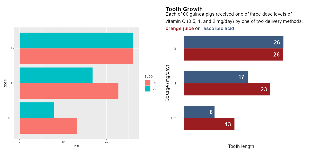{fig-alt="Before and after bar charts visualising tooth growth of guinea pigs. Left is unstyled with default colour scheme. Right is styled with labelled bars, a text legend, and easier to read fonts."}](images/styling-intro.png)## ColoursColour choices can strongly impact the accessibility of your data visualisation. The correct use of colour can also help to emphasise the story you are trying to tell.Before you get into choosing colours, ask yourself the question: do I really need to use colour here? @Beecham2021 showed that the use of colour is one of the least effective methods for visually communicating differences between variables.```{r}library(dplyr)library(ggplot2)plot_data <- mtcars %>%mutate(car =rownames(mtcars))# Colour all barsggplot(data = plot_data,mapping =aes(y =reorder(car, disp),x = disp,fill = car )) +geom_col() +labs(x ="Variable 1",y ="" ) +coord_cartesian(expand =FALSE) +theme_minimal(base_size =14) +theme(legend.position ="none",legend.title =element_blank(),plot.title =element_text(face ="bold",margin =margin(b =10) ),plot.title.position ="plot",plot.margin =margin(15, 10, 10, 15) )# Highlight one barggplot(data = plot_data,mapping =aes(y =reorder(car, disp),x = disp,fill = (car =="Maserati Bora") )) +geom_col() +scale_fill_manual(values =c("#AFE1AF", "#7a9d7a")) +labs(x ="Variable 1",y ="" ) +coord_cartesian(expand =FALSE) +theme_minimal(base_size =14) +theme(legend.position ="none",legend.title =element_blank(),plot.title =element_text(face ="bold",margin =margin(b =10) ),plot.title.position ="plot",plot.margin =margin(15, 10, 10, 15) )```[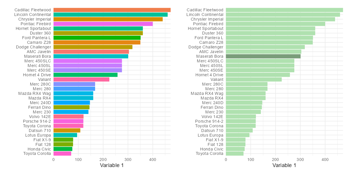{fig-alt="Before and after bar charts visualising car data. Left has a different colour for each bar. Right uses colour to highlight a specific bar."}](images/styling-highlight.png)In the bar chart example above, rather than duplicating the information on the y-axis and colouring each bar a different colour, a better approach is to use colour to highlight a specific element of the data, e.g., a specific car, which focuses the reader's attention straight to the point you are trying to make.It's useful not to rely on colour as the only factor which distinguishes data points in different groups. For example, in scatter plots, as well as colouring points in two groups either green or orange, the points could be encoded as circles and triangles.```{r}library(readr)library(dplyr)library(tidyr)library(ggplot2)wheels <-read_csv("https://raw.githubusercontent.com/rfordatascience/tidytuesday/master/data/2022/2022-08-09/wheels.csv" )plot_data <- wheels %>%select(country, height, diameter) %>%drop_na() %>%filter(country %in%c("USA", "Japan"))# Colour onlyggplot(data = plot_data,mapping =aes(x = diameter,y = height,colour = country )) +geom_point(size =3, alpha =0.8) +scale_x_continuous(limits =c(0, 800)) +scale_y_continuous(limits =c(0, 800)) +scale_colour_brewer(palette ="Dark2") +coord_cartesian(expand =FALSE) +labs(title ="Ferris wheels",x ="Diameter (ft)",y ="Height (ft)" ) +theme_minimal(base_size =14) +theme(legend.position ="top",legend.title =element_blank(),plot.title =element_text(face ="bold",margin =margin(b =10) ),plot.title.position ="plot",plot.margin =margin(15, 10, 10, 15) )# Shapes and coloursggplot(data = plot_data,mapping =aes(x = diameter,y = height,colour = country,shape = country )) +geom_point(size =3, alpha =0.8) +scale_x_continuous(limits =c(0, 800)) +scale_y_continuous(limits =c(0, 800)) +scale_colour_brewer(palette ="Dark2") +coord_cartesian(expand =FALSE) +labs(title ="Ferris wheels",x ="Diameter (ft)",y ="Height (ft)" ) +theme_minimal(base_size =14) +theme(legend.position ="top",legend.title =element_blank(),plot.title =element_text(face ="bold",margin =margin(b =10) ),plot.title.position ="plot",plot.margin =margin(15, 10, 10, 15) )```[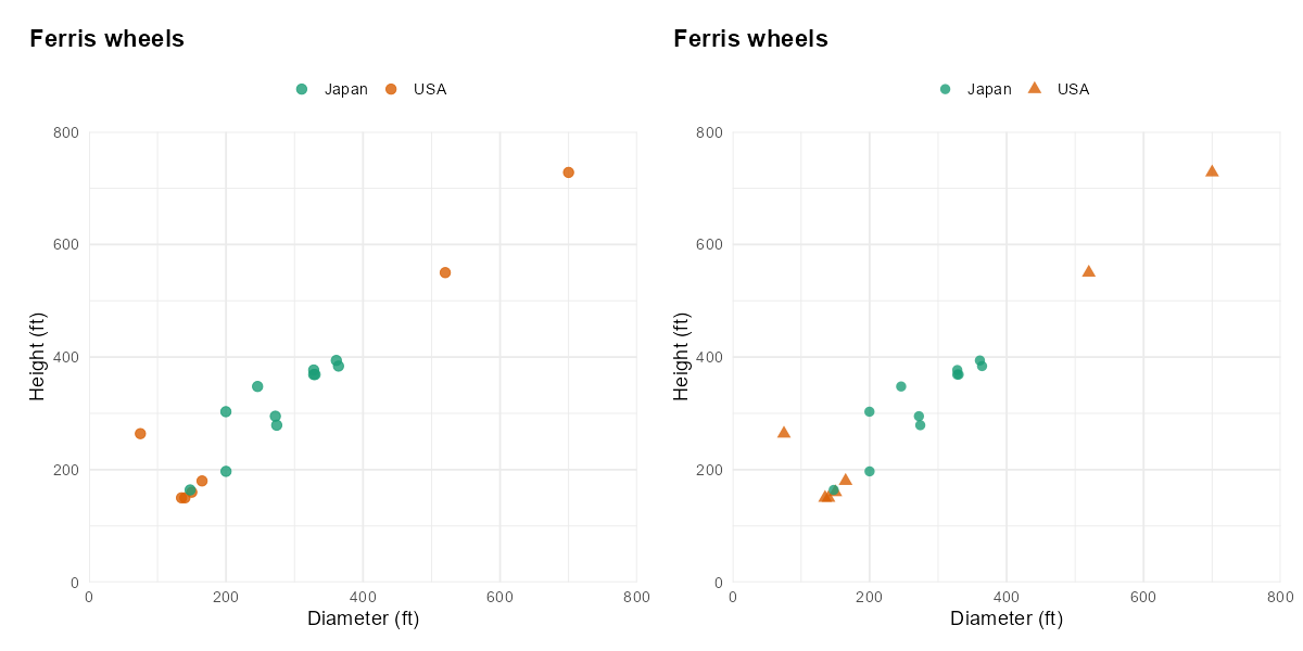{fig-alt="Before and after scatterplots visualising Ferris wheel data. Left uses only colour to differentiate country. Right also uses different shapes."}](images/styling-shapes.png)Despite the difficulties that can arise from ineffective use, colour remains one of the most common methods for either distinguishing between categories, or showing changes in a value. If you decide to use colours, you then need to decide which colours to use.### Types of colour paletteColour palettes generally fall into one of three categories, and the type of colour palette you choose should reflect the type of data you are visualising.- **Sequential**: used to visualise data that is ordered from low to high (or vice versa), e.g., temperature.- **Diverging**: used to visualise data that is ordered and diverges from an important midpoint, e.g., days of above- or below-average temperature, in two directions.- **Qualitative**: used to visualise categorical data, where the magnitude of difference between, and ordering of, categories is not meaningful, e.g., distinct railway lines.```{r}library(ggplot2)library(PrettyCols)# Sequentialggplot(data =data.frame(x =1:7, y =1),mapping =aes(x = x, y = y, fill = x)) +geom_tile() +labs(title ="Sequential") +scale_fill_pretty_c("Teals") +theme_void() +theme(legend.position ="none",plot.title =element_text(size =20, face ="bold"),plot.margin =margin(15, 10, 10, 15) )# Divergingggplot(data =data.frame(x =1:7, y =1),mapping =aes(x = x, y = y, fill = x -mean(x))) +geom_tile() +labs(title ="Diverging") +scale_fill_gradient2(low ="#f1a340", high ="#998ec3") +theme_void() +theme(legend.position ="none",plot.title =element_text(size =20, face ="bold"),plot.margin =margin(15, 10, 10, 15) )# Qualitativeggplot(data =data.frame(x =1:7, y =1),mapping =aes(x = x, y = y, fill =factor(x))) +geom_tile() +labs(title ="Qualitative") +scale_fill_brewer(palette ="Dark2") +theme_void() +theme(legend.position ="none",plot.title =element_text(size =20, face ="bold"),plot.margin =margin(15, 10, 10, 15) )```[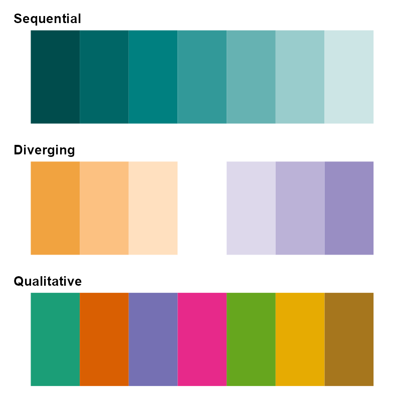{fig-alt="Three colour palette plots showing sequential blue colours, diverging orange to purple colours, and bold qualitative colours."}](images/styling-palettes.png)### Accessible colour palettesWhen choosing a particular colour palette, there are several important factors to consider.Colours should be distinct from each other, for all readers. There are several different forms of colour blindness which can cause some colours to appear indistinguishable. The use of a [colour blind checker](https://www.color-blindness.com/coblis-color-blindness-simulator/)[@Colblindor] can show you what your plots may look like under different types of colour blindness. This is particularly important for diverging and qualitative palettes where the distinction between hues is used to tell apart different values. In contrast, sequential palettes often use luminosity to show how values change. @Hoellt2023 note that single hue palettes are a safer choice as they are typically more likely to be colourblind friendly. @Hoellt2023 also note that the larger the variability across luminosity and chroma (purity of colour), the likelier it is that the colours are more distinguishable by those with colour blindness. [Paul Tol](https://personal.sron.nl/~pault/)[-@Tol2021] has some very useful resources on choices of colours, and several suggested palettes.```{r}library(ggplot2)library(dplyr)library(ggtext)library(colorblindr)plot_data <- ToothGrowth %>%mutate(dose =factor(dose)) %>%group_by(dose, supp) %>%summarise(len =mean(len)) %>%ungroup()g <-ggplot(data = plot_data,mapping =aes(x = len, y = dose, fill = supp)) +geom_col(position =position_dodge(width =0.7),width =0.7 ) +scale_x_continuous(limits =c(0, 30),name ="Tooth length" ) +geom_text(mapping =aes(label =round(len, 0)),position =position_dodge(width =0.7),hjust =1.5,size =6,fontface ="bold",colour ="white" ) +scale_fill_manual(values =c("#9B1D20", "#3D5A80")) +labs(title ="Tooth Growth",subtitle ="Each of 60 guinea pigs received one of three dose levels of vitamin C (0.5, 1, and 2 mg/day) by one of two delivery methods: <span style='color: #9B1D20'>**orange juice**</span> or <span style='color: #3D5A80'>**ascorbic acid**</span>.",y ="Dosage (mg/day)" ) +theme_minimal(base_size =14) +theme(legend.position ="none",plot.title =element_textbox_simple(face ="bold"),plot.subtitle =element_textbox_simple(margin =margin(t =10),lineheight =1.5 ),plot.title.position ="plot",plot.margin =margin(15, 10, 10, 15),panel.grid =element_blank(),axis.text.x =element_blank() )cvd_grid(g)```[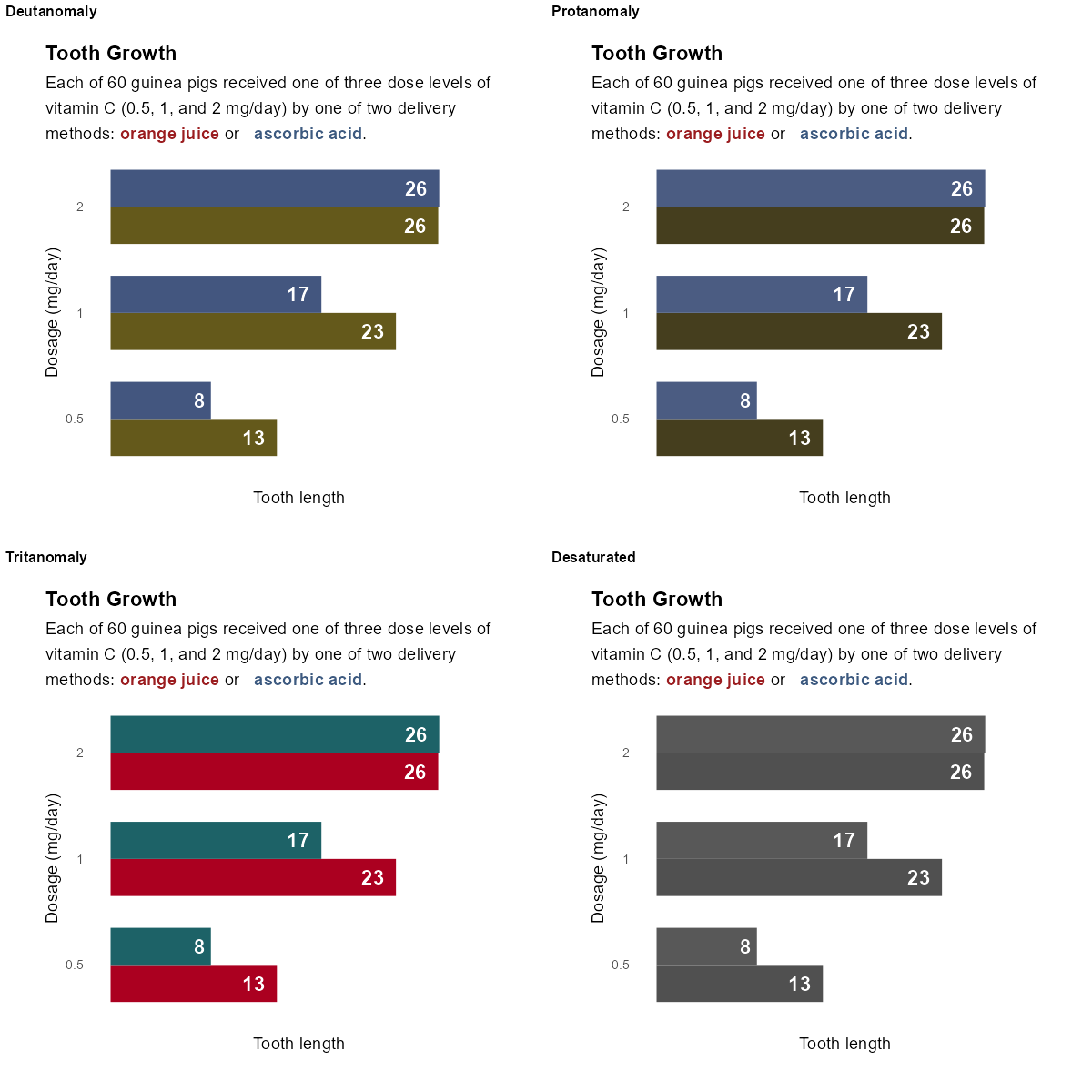{fig-alt="A 2x2 grid showing a bar chart under three types of colour blindness, and in monochrome. The monochrome is especially hard to differentiate colours."}](images/styling-colours.png)Colours should appear distinct from each other when printed in black and white. Readers, or indeed academic journals, may choose to print your visualisations in monochrome. Colours that seem visually distinct that have similar luminosity (a measure of how light or dark a hue is) may appear indistinguishable when printed in black and white.Colours should appropriately match your data. It's important not to play into stereotypes, e.g., choosing pink and blue for data relating to women and men. Don't confuse your readers by flipping common colour associations around, e.g., red for good and green for bad. @Muth2018 discusses the use of colour to display gender data, and many of the points can be extended to other types of data.### Checklist- Minimise the number of different colours used.- Check that your colours are colour blind friendly, and have sufficient contrast when viewed in monochrome.- Check that the type of colour palette matches the type of data visualised.- Use non-colour elements to distinguish between different groups where possible.- Avoid stereotypes and confusing associations with different colours.## AnnotationsWhen talking about adding annotations to data visualisations, we simply mean adding text that adds a comment or clarification in order to help the reader understand the point made in the graphic. Annotations can be used to add details or explanation, highlight an interesting data point, or clarify how the chart should be interpreted. Although additional text can be extremely useful to a reader, it's important not to overload a data visualisation with text as it can be distracting and make it more difficult to focus the point.A common use of annotation that enhances clarity of data visualisations is directly labelling data points on line graphs or bar charts. In line graphs, it's common to label the value at the end of the line as it's often far away from the y-axis labels (on the left by default). In bar charts, adding the values for each bar at, or near, the end of each bar also means readers don't have to look up the values themselves. This can reduce the amount of eye movement required for readers to find the exact values and allows them to make better, more accurate comparisons. This isn't always required if, for example, these values are additionally provided in a table.```{r}library(ggplot2)library(dplyr)plot_data <- ToothGrowth %>%mutate(dose =factor(dose)) %>%group_by(dose, supp) %>%summarise(len =mean(len)) %>%ungroup()# Not annotatedggplot(data = plot_data,mapping =aes(x = len,y = dose,fill = supp )) +geom_col(position =position_dodge(width =0.7),width =0.7 ) +scale_x_continuous(limits =c(0, 30),name ="Tooth length" ) +scale_fill_manual(name ="Supplement: ",values =c("#9B1D20", "#3D5A80") ) +labs(title ="Tooth Growth",y ="Dose" ) +theme_minimal(base_size =14) +theme(legend.position ="top",plot.title =element_text(face ="bold"),plot.title.position ="plot",plot.margin =margin(15, 10, 10, 15) )# Annotatedggplot(data = plot_data,mapping =aes(x = len,y = dose,fill = supp )) +geom_col(position =position_dodge(width =0.7),width =0.7 ) +scale_x_continuous(limits =c(0, 30),name ="Tooth length" ) +geom_text(mapping =aes(label =round(len, 0)),position =position_dodge(width =0.7),hjust =1.5,size =6,fontface ="bold",colour ="white" ) +scale_fill_manual(name ="Supplement: ",values =c("#9B1D20", "#3D5A80") ) +labs(title ="Tooth Growth",y ="Dose" ) +theme_minimal(base_size =14) +theme(legend.position ="top",plot.title =element_text(face ="bold"),plot.title.position ="plot",plot.margin =margin(15, 10, 10, 15) )```[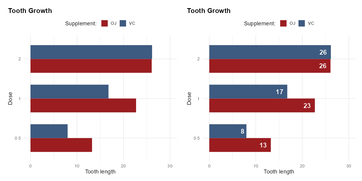{fig-alt="A before and after showing the same bar chart of tooth growth data without annotations on the left, and with labels showing bar values on the right."}](images/styling-annotate-bars.png)The placement of annotations is also key:- In a scatter plot, directly labelling every data point isn't usually an option as there are too many points to label without clutter. Instead, you may choose to highlight only one or two interesting points, such as outliers.- When adding more extensive text to explain an outlier or point of interest, place the text in a relevant position. For example, if you're annotating a line chart to explain a decrease in value in 2008, position the text near to 2008.- Don't fill every white space with text. @ONSstyle recommends [a maximum of 3 or 4 annotations per chart](https://style.ons.gov.uk/data-visualisation/titles-and-text/annotation-and-footnotes/) to avoid overwhelming readers. This also means keeping annotations brief and to the point. This is especially true for data visualisations that accompany journal publications or magazine articles where further textual explanation is likely included already.### Checklist- Check if there are outliers that need further explanation, or values that could be directly labelled.- Labels are positioned sensibly, and the data visualisation does not feel crowded with text.- Make sure there is sufficient contrast between the text and the background.## FontsFont choice is a key component of making your data visualisations easy to understand. Some fonts are easier to read than others, and this is particularly true for those with visual impairments, or a learning disability such as dyslexia. A poor choice of font may make your visualisation inaccessible to a significant number of people in your audience.Try to minimise the number of different types of font you use: use a fixed set of sizes, a maximum of two different font families, and minimise the use of mixing font faces. This all helps to reduce unnecessary work from a reader when they look at your visualisation. Previous advice relating to choice of colour is also relevant here - it's particularly important to check there is sufficient contrast between the background colour and the text colour.### Font sizeLarger fonts are easier to read. It's generally recommended that font size is at least 12pt for printed materials or websites. If you're creating a presentation, fonts should be at least 36pt to make sure they're visible to people nearer the back of the room.### Font familySo what makes a good choice of font family? There are three main types of font:- **Serif**: serifs are the small strokes on the ends of some longer strokes that occur in some fonts. Fonts that have these serifs are called serif fonts.- **Sans serif**: Fonts without serifs are called sans serif fonts.- **Monospace**: monospace fonts are those whose characters each take up an equal width.There is no consensus as to which type of font (serif, sans serif, or monospace) is more accessible. The simpler characters of sans serif fonts may increase readability for visually impaired readers, while those with dyslexia may find the characters more difficult to tell apart. Serif fonts (such as Times New Roman) can be more difficult to read as the decorative lines distract from the shape of the letter. This is especially true in digital publications where on-screen pixelation can further distort the letters. We'd recommend avoiding serif fonts for any text in images that will appear online. Common sans serif fonts such as Arial, Calibri, and Verdana are often considered to be accessible.[Dyslexie](https://www.dyslexiefont.com/) and [OpenDyslexic](https://opendyslexic.org/) are fonts specifically designed to aid readability for those with dyslexia, as they increase font weight at the bottom of the letters which reduces how much the letters appear to move around. Atkinson Hyperlegible is a font developed by the Braille Institute of America, which is designed to maximise distinction between different characters for low vision readers. It's freely available, and can be downloaded from the [Braille Institute](https://brailleinstitute.org/freefont) or used through [Google Fonts](https://fonts.google.com/specimen/Atkinson+Hyperlegible). There is conflicting evidence about whether or not specially designed fonts are actually more accessible [@Rello2016, @Wery2017]. Therefore, sticking with a sans serif font is likely a safer choice.Some fonts, particularly sans serif fonts, have characters which appear very similar to other characters. For example, a capital I, lowercase l, and number 1, can sometimes be indistinguishable. Choose a font face with a distinguishable feature for each letter and number. Source Sans Pro and Verdana both meet this condition.### Font faceFont faces, e.g., bold or italic effects, can be used to emphasise particular parts of text. For example, a plot annotation may highlight a specific value placed in amongst some explanatory text. Italicised text is generally considered more difficult to read [@Rello2016], as is capitalised text when used for the purpose of emphasis. Instead, use bold text to highlight (sparingly!).### ChecklistAs you can see, there is no single font recommendation that will ensure your visualisation is accessible to all. However, there are some things you can do to improve accessibility.- Ensure the font size is at least 12 pt.- Ensure that a capital I, lowercase l, and number 1 are distinguishable.- Minimise the number of different fonts used (no more than two).- Minimise the use of italics and uppercase text, and instead use (sparingly) bold text for emphasis.## Alt TextAlt text (short for alternative text) is text that describes the visual aspects and purpose of an image -- including charts. Though alt text has various uses, its primary purpose is to aid visually impaired users in interpreting images when the alt text is read aloud by screen readers.In @Green2023, Mine Dogucu discusses the importance of adding alt text to your data visualisations, to ensure those who are blind or visually impaired don't miss out on the content in your charts. @Cesal2020 provides a simple structure to aid you in writing alt text for data visualisations.


