install.packages("RSSthemes")Styling charts for RSS publications
Styling charts with different tools
In this section, we discuss the technical details of how to change the style of charts built with some of the most common types of software used to create data visualisations.
R
R (R Core Team 2021) is a programming language which is popular for statistical computing and graphics. There are many packages with R that can be used to create data visualisations, and we don’t aim to cover them all here. Instead, we address the most common methods: built-in base R graphics, and the {ggplot2} package (Wickham 2016).
To help authors with styling their charts to fit in with the guidance in this document, we have developed an R package, {RSSthemes}. We include some examples of using the package here, but encourage readers to check the GitHub repository for any updates.
You can install the {RSSthemes} package from CRAN using:
You can install the development version from GitHub (although we can’t promise it will be as stable as the CRAN version):
remotes::install_github("nrennie/RSSthemes")You can then load the package using:
library(RSSthemes)Base R
R has built-in graphics capabilities that allow users to make a wide range of data visualisations without installing any additional packages. This blog post from Jumping Rivers (“Styling Base r Graphics” 2018) provides instructions on how to style graphics created in base R.
Example: changing bar chart colours in base R.
If all of the bars, lines, points, etc. should have the same colour, you can set the col argument to have one of the RSS colours. The options are: signif_red, signif_blue, signif_green, signif_orange, or signif_yellow.
barplot(table(mtcars$gear), col = signif_blue)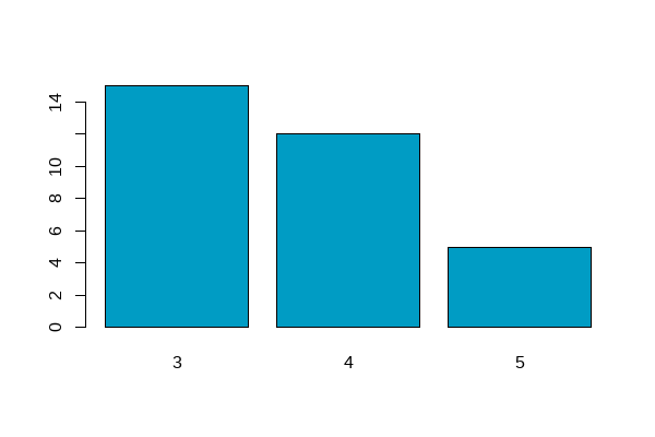
If the colours in your plot are based on values in your data, you can set the default colours using the palette() function. Within {RSSthemes}, the set_rss_palette() function changes the default colours used. There are currently three palettes available in {RSSthemes}, although we hope to add more in the future. The options are signif_qual, signif_div, or signif_seq.
set_rss_palette("signif_qual")
plot(1:4, 1:4, col=1:4, pch=19, cex=3, xlab="", ylab="")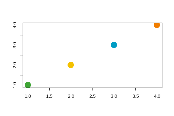
signif_qual palette.Run palette("default") to reset to original base R colours.
Example: changing the styling of base R plots.
Within the plot() function (and related base R plotting functions such as barplot(), and hist()) , there are arguments to control how the non-data elements of the plot look. For example, the family argument changes which font family is used. You can also set many of these arguments globally by calling the par() function. Within {RSSthemes}, there is a function set_signif_par() which sets some default options, including the text alignment and font for all base R plots. We also recommend adding reference lines using the abline() function.
set_signif_par()
plot(1:4, 1:4, col=1:4, pch=19, cex=3, xlab="", ylab="",
     main = "My Significance Plot",
     sub = "Source: data source")
abline(h=1:4, v=1:4, col = "lightgrey")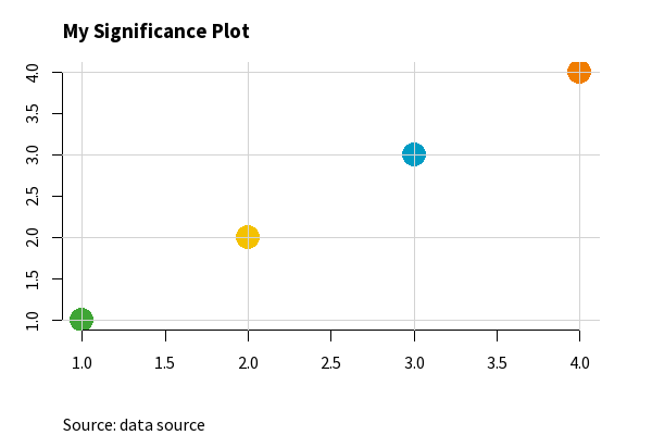
set_signif_par().{ggplot2}
{ggplot2} is an R package within the {tidyverse} framework specifically for creating data visualisations. The package documentation provides guidance on how to create different types of charts. Advice on changing the colours and styles of {ggplot2} visualisations, can be found in the ggplot2: Elegant Graphics for Data Analysis book by Hadley Wickham (Wickham 2016).
Let’s set up a basic data set to make some plots with {ggplot2}.
library(ggplot2)
plot_df <- data.frame(x = LETTERS[1:4],
y = 1:4)Example: changing the non-mapped colours in {ggplot2}.
In {ggplot2}, the colour (or color) argument changes the colour that outlines an element, and fill changes the colour that fills the element. If all of the, e.g., bars, lines, or points should have the same colour, you can set either the fill or colour arguments to have one of the RSS colours. The options are: signif_red, signif_blue, signif_green, signif_orange, or signif_yellow.
ggplot(data = plot_df,
       mapping = aes(x = x, y = y)) +
  geom_col(fill = signif_yellow)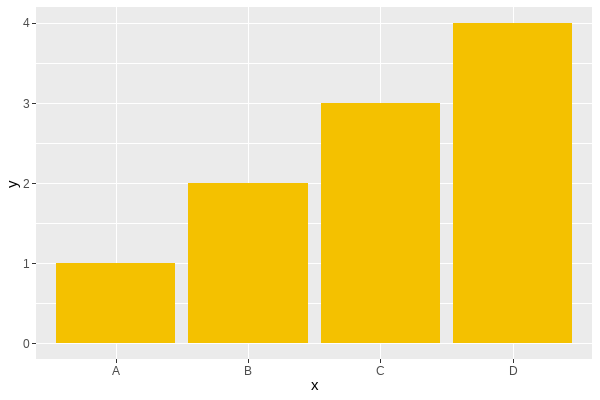
Example: using a discrete colour scale in {ggplot2}.
For working with qualitative (discrete) data, the best palette to use is "signif_qual". This palette currently only contains four colours.
- Discrete (fill) scale:
scale_fill_rss_d()
ggplot(data = plot_df,
       mapping = aes(x = x, y = y, fill = x)) +
  geom_col() +
  scale_fill_rss_d(palette = "signif_qual")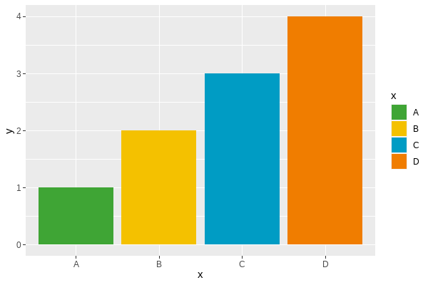
signif_qual.- Discrete (colour) scale:
scale_colour_rss_d()
ggplot(data = plot_df,
       mapping = aes(x = x, y = y, colour = x)) +
  geom_point(size = 4) +
  scale_colour_rss_d(palette = "signif_qual")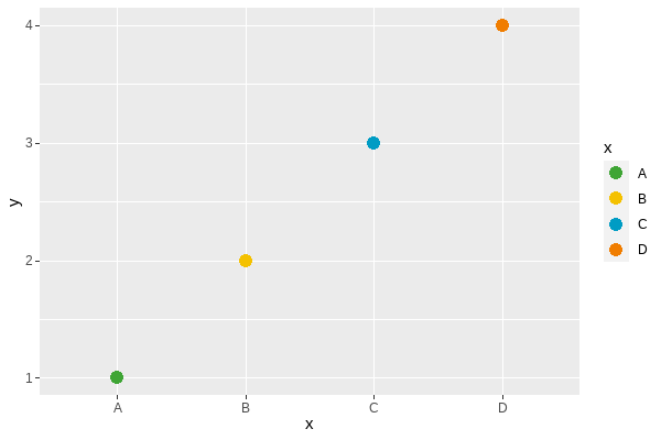
signif_qual.Example: using a continuous colour scale in {ggplot2}.
Continuous colour scales may be sequential or diverging. For working with sequential (continuous) data, the best palette to use is "signif_seq".
- Continuous (fill) scale:
scale_fill_rss_c()
ggplot(data = plot_df,
       mapping = aes(x = x, y = y, fill = y)) +
  geom_col() +
  scale_fill_rss_c(palette = "signif_seq")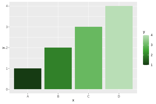
- Continuous (colour) scale:
scale_colour_rss_c()
ggplot(data = plot_df,
       mapping = aes(x = x, y = y, colour = y)) +
  geom_point(size = 4) +
  scale_colour_rss_c(palette = "signif_seq")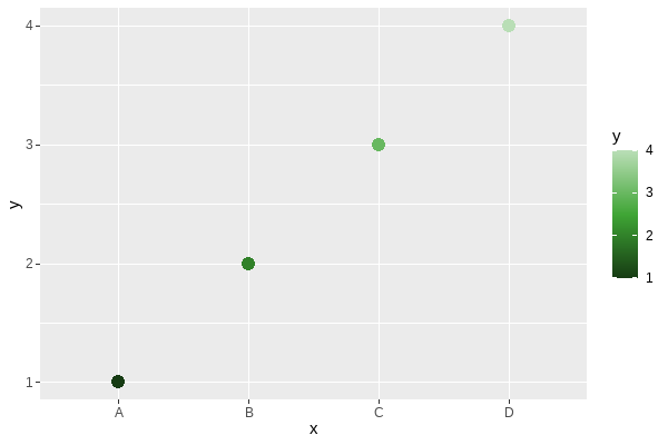
For working with diverging (continuous) data, the best palette to use is "signif_div".
- Continuous (fill) scale:
scale_fill_rss_c()
ggplot(data = plot_df,
       mapping = aes(x = x, y = y, fill = y)) +
  geom_col() +
  scale_fill_rss_c(palette = "signif_div")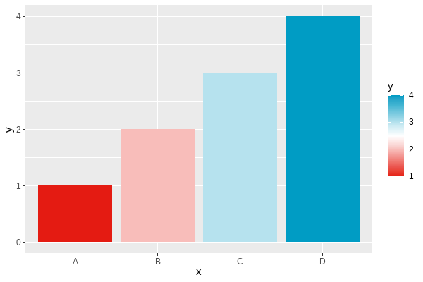
If you want to centre the diverging scale around a different value, you can alternatively pass the pre-defined colours from {RSSthemes} into scale_fill_gradient2() in {ggplot2}:
ggplot(data = plot_df,
       mapping = aes(x = x, y = y, fill = y)) +
  geom_col() +
  scale_fill_gradient2(low = signif_red, high = signif_blue, midpoint = 2)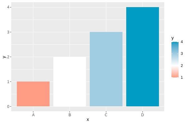
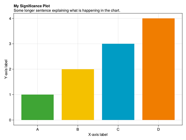
Example: changing the theme in {ggplot2}.
Within {ggplot2}, themes allow you to control the appearance of the non-data elements of your plot. The default theme is theme_grey() which has a darker background. We recommend using a white or transparent background, such as those created with theme_minimal() or theme_bw().
You can also use theme_significance() from {RSSthemes} which additionally sets the plot font to one of those used in Significance magazine. Check that you have already run library(RSSthemes) to ensure the fonts load correctly.
ggplot(data = plot_df,
       mapping = aes(x = x, y = y, fill = x)) +
  geom_col() +
  labs(title = "My Significance Plot",
       subtitle = "Some longer sentence explaining what is happening in the chart.",
       caption = "Source: name of data source") +
  scale_fill_rss_d(palette = "signif_qual") +
  theme_significance()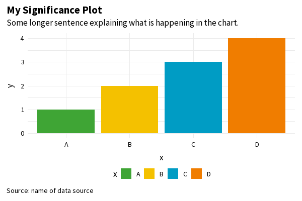
theme_significance().If you find a bug in the {RSSthemes} package, or something that isn’t working quite as you expected, please submit a GitHub issue.
Exporting images from R
There are different ways to export and save images from R. Using the Export button on the Plots pane in RStudio doesn’t usually result in images of high enough resolution for publication quality graphics. The minimum image resolution for images published in print is 300 dpi. If you use ggsave() from {ggplot2}, 300 dpi is the default resolution. We recommend saving images in PDF or EPS file format as this makes it easier for them to be resized.
Further information on specific image sizes for different RSS publications is given in the Publication specifications section.
As an example, suppose you were creating a plot for the Features section of Significance magazine, and you wanted the plot to span two of the three columns. From the table below, the width of the image should be 124 mm. To use the pdf() function to save an image, the width and height should be in inches (124 mm ~ 4.88 in). If we want a 2:1 aspect ratio, we make the height equal to half the width:
pdf(file = "significance-feature-plot.pdf", # name of file
    width = 4.88,                           # width of plot
    height = 4.88 / 2                       # height of plot
    )
plot(1:4, 1:4)
dev.off()
Python
Python is a general-purpose programming language, with libraries available that provide capabilities for data analysis and visualisation.
A work-in-progress Python package for implementing RSS colour palettes can be found at github.com/nrennie/RSSpythemes. If you’d like to contribute to this Python package development, please raise an issue or create a pull request on GitHub.
Matplotlib
Matplotlib is a Python library for creating static, animated, and interactive data visualisations.
Example: changing bar chart colours in matplotlib.
You can change the colour of chart elements in matplotlib using the color argument:
import matplotlib.pyplot as plt
# generate data
x_vals = ['A', 'B', 'C', 'D']
y_vals = [1, 2, 3, 4]
# create barchart
plt.bar(x_vals, y_vals, color = "#009cc4")
plt.show()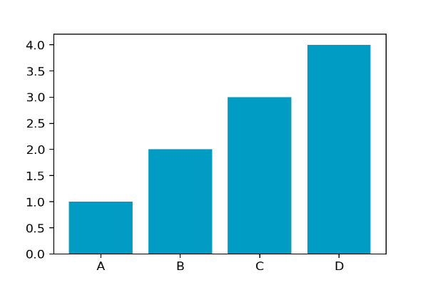
If the colours in your plot are based on values in your data, you can also change the colours used by providing a list of colours:
# define colour palette
signif_qual = ['#3fa535', '#f4c100', '#009cc4', '#f07d00']
# create barchart
plt.bar(x_vals, y_vals, label = x_vals, color = signif_qual)
plt.show()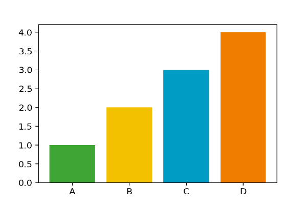
signif_qual palette.Example: changing the font family in matplotlib.
You can change the font used in all elements of the plot using rcParams. Good practice when setting a custom font family is to add a generic font family (such as sans serif) as a back up. If you’re using a font that isn’t pre-installed on your system, you can load it in using font_manager:
from matplotlib import font_manager
font_manager.fontManager.addfont("SourceSans3-Regular.ttf")
You can specify a different font family, weight, or size using fontdic for individual elements.
# define fonts
from matplotlib import rcParams
rcParams['font.family'] = ['Source Sans 3', 'sans-serif']

# create barchart
fig, ax = plt.subplots(1, 1)
plt.bar(x_vals, y_vals, color = signif_qual, label = x_vals)
plt.title('My Significance Plot', fontdict = {'fontsize':14}, loc = 'left')
# add grid lines lines
ax.set_axisbelow(True)
ax.xaxis.grid(color = 'lightgrey')
ax.yaxis.grid(color = 'lightgrey')
# add legend below plot
ax.legend(ncol = 4, loc = 'lower center',
          bbox_to_anchor = (0.5, -0.15), frameon = False)
plt.show()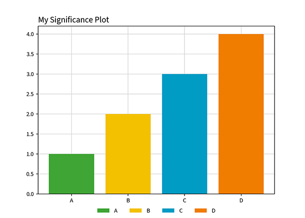
Julia
Julia is a general-purpose programming language, focused in high performance, while providing easy syntax. Julia has libraries available that provide capabilities for data analysis and visualisation.
Makie
Makie is a high-level plotting library for the Julia programming language.
Example: changing bar chart colours in Makie.
You can change the colour of chart elements in Makie using the color argument and custom tick labels using the xticks argument inside axis:
using CairoMakie
# generate data
x_vals = [1, 2, 3, 4]
y_vals = [1, 2, 3, 4]
# create barchart
barplot(x_vals, y_vals, color="#009cc4", axis=(; xticks=(1:4, ["A", "B", "C", "D"])))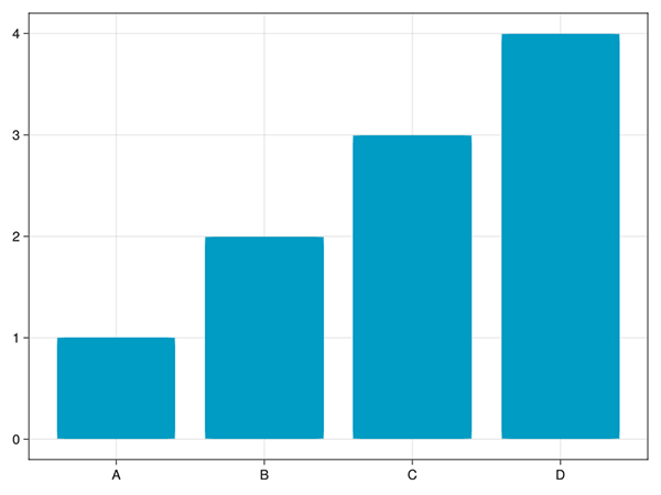
If the colours in your plot are based on values in your data, you can also change the colours used by providing a list of colours:
# define colour palette
signif_qual = ["#3fa535", "#f4c100", "#009cc4", "#f07d00"]
# create barchart
barplot(x_vals, y_vals, color=signif_qual, axis=(; xticks=(1:4, ["A", "B", "C", "D"])))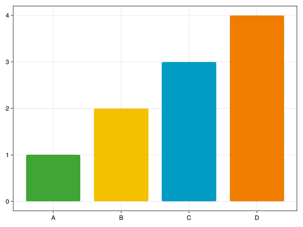
signif_qual palette.You can specify custom labels and titles using the axis argument:
# define labels and title
title = "My Significance Plot"
subtitle = "Some longer sentence explaining what is happening in the chart."
xlabel = "X-axis label"
ylabel = "Y-axis label"

# create barchart
barplot(x_vals,
        y_vals;
        color=signif_qual,
        axis=(;
            xticks=(1:4, ["A", "B", "C", "D"]),
            title=title,
            subtitle=subtitle,
            titlealign=:left,
            xlabel=xlabel,
            ylabel=ylabel,
        ),
)
AlgebraOfGraphics
AlgebraOfGraphics is a high-level plotting library for the Julia programming language that uses Makie as a plotting backend. It follows the grammar of graphics and is similar to R’s ggplot2.
Example: changing bar chart colours in AlgebraOfGraphics.
You can change the colour of chart elements in Makie using the color argument and custom tick labels using the xticks argument inside axis:
using AlgebraOfGraphics
using CairoMakie
# generate data
x_vals = [1, 2, 3, 4]
y_vals = [1, 2, 3, 4]
# create barchart
plt = data((; x_vals, y_vals)) * mapping(:x_vals, :y_vals) * visual(BarPlot; color="#009cc4")
draw(plt; axis=(; xticks=(1:4, ["A", "B", "C", "D"])))
If the colours in your plot are based on values in your data, you can also change the colours used by providing a list of colours:
# define colour palette
signif_qual = ["#3fa535", "#f4c100", "#009cc4", "#f07d00"]
# create barchart
plt = data((; x_vals, y_vals)) * mapping(:x_vals, :y_vals) * visual(BarPlot; color=signif_qual)
draw(plt; axis=(; xticks=(1:4, ["A", "B", "C", "D"])))
signif_qual palette.You can specify custom labels and titles using the axis argument:
# define labels and title
title = "My Significance Plot"
subtitle = "Some longer sentence explaining what is happening in the chart."
xlabel = "X-axis label"
ylabel = "Y-axis label"

# create barchart
draw(plt;
     axis=(;
         xticks=(1:4, ["A", "B", "C", "D"]),
         title=title,
         subtitle=subtitle,
         titlealign=:left,
         xlabel=xlabel,
         ylabel=ylabel,
     ),
)
Publication specifications
The following information should be used to design graphs and charts that meet RSS publication requirements. Details include page sizes and column widths, font types and sizes, and image resolutions and file formats.
Significance Magazine
| Page size | (W) 212.55 mm x (H) 263.65 mm |
| Text area | (W) 188 mm x (H) 212 mm |
| Image resolution | 300 dpi (print quality) |
| Recommended image file formats | jpeg, png |
Notebook section
Uses four-column layout.
| 1x column width | 45 mm |
| 2x column width | 93 mm |
| 3x column width | 140 mm |
| 4x column width | 188 mm |
| Body font | Meta Serif OT, Book |
| Font size | 8.5 pt |
| Section colour | Red:
|
Features section
Uses three-column layout.
| 1x column width | 60 mm |
| 2x column width | 124 mm |
| 3x column width | 188 mm |
| Body font | Source Sans Pro, Regular |
| Font size | 9 pt |
| Section colour | Green:
|
Profiles / Perspectives / Statscom section
Uses three-column layout.
| 1x column width | 60 mm |
| 2x column width | 124 mm |
| 3x column width | 188 mm |
| Body font | Meta Serif OT, Book |
| Font size | 8.5 pt |
| Section colours: | |
| Profiles | Blue:
|
| Perspectives | Yellow:
|
| Statscomm | Orange:
|
Journal of the Royal Statistical Society Series A
Uses a single-column layout.
| Page size | (W) 189 mm x (H) 246 mm |
| Text area | (W) 136 mm x (H) 217 mm |
| Body font | Sabon LT Std Roman |
| Font size | 9.25 pt |
| Image resolution | 300 dpi (print quality) |
| Recommended image file formats | jpeg, png |
References
R Core Team. 2021. R: A Language and Environment for Statistical Computing. Vienna, Austria: R Foundation for Statistical Computing. https://www.R-project.org/.
“Styling Base r Graphics.” 2018. Jumping Rivers. 2018. https://www.jumpingrivers.com/blog/styling-base-r-graphics/.
Wickham, Hadley. 2016. Ggplot2: Elegant Graphics for Data Analysis. Springer-Verlag New York. https://ggplot2.tidyverse.org.