Why we visualise data
Motivation
Data visualisations can be a very efficient means of identifying patterns in data and conveying a message. The scientific aim of any visualisation is to allow the reader to understand data and extract information:
intuitively;
efficiently; and
accurately.
It is important, when creating a visualisation, to consider the background of the reader or intended audience (Krause 2013). Interpretation is in the eye of the beholder, and a visualisation will only succeed at conveying its message if designed with its audience in mind.
A successful data visualisation will:
- Grab attention
-
In a sea of text, a visualisation will stand out. If a reader is short on time or uncertain about whether a document is of interest, an attention-grabbing visualisation may entice them to start reading.
- Improve access to information
-
Textual descriptions can be lengthy and hard to read, while skilfully created visualisations permit the extraction of key information more efficiently, making information extraction a fun task.
- Increase precision
-
Textual descriptions are frequently less precise than a visual depiction showing data points and corresponding axes, while a text with too many precise numbers can make it hard to follow a line of argument.
- Bolster credibility
-
While a textual summary provides a story, a visualisation of the data can add credibility to otherwise unsubstantiated claims: readers can see the numbers for themselves and arrive at the (same?) conclusions.
- Summarise content
-
Visual displays allow for summarising complex textual content, aiding the reader in memorising key points.
For these reasons, data visualisations are key elements in almost any kind of publication – scientific papers, media reports, conference presentations, social media posts, video summaries, etc.
Tables, too, are a way to visualise data or statistics, and can be similarly important components of a publication. A table may in some cases visualise data better than a graphic. For example, five numbers are probably better displayed in a table than in a complex pie chart that uses colours, angles, and possibly shading and more than two dimensions.
A brief history of data visualisation
Data visualisation has been, for a long time, both a topic of scientific research and an evolving art form with a variety of high-impact applications.
In 1859, Florence Nightingale, the founder of modern nursing, published her findings on the sanitary status of the British army during the war with Russia. She showed raw data as well as summary statistics in tables and charts (Nightingale, 1859). One chart in particular continues to be celebrated today: a polar area chart on the “causes of mortality in the army in the East”.
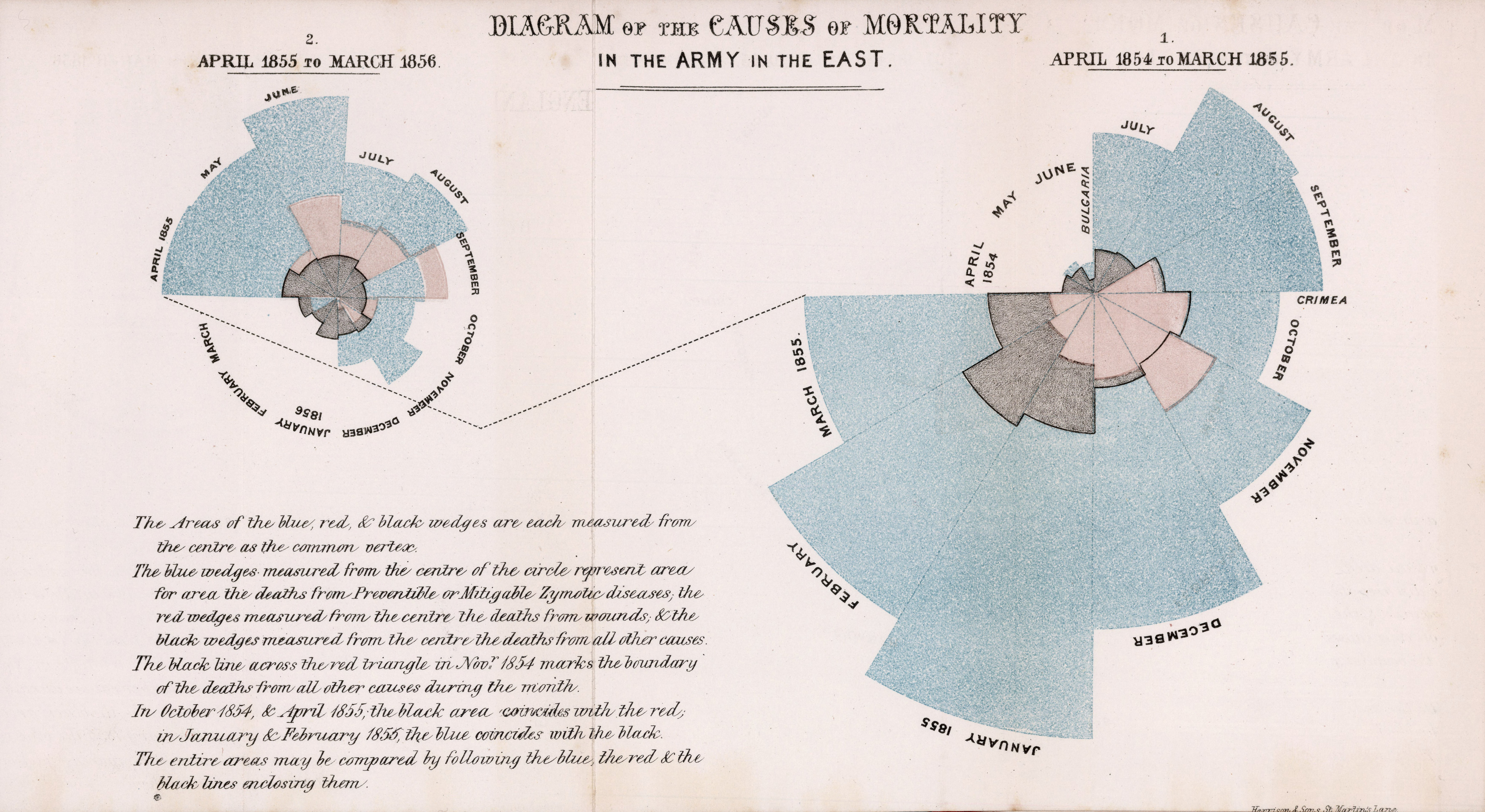
What made Nightingale’s graphs “particularly iconic was their powerful use of visual rhetoric to make an argument about data” (Hedley 2020). This quality is also evident in other visualisations produced by Nightingale’s contemporaries.
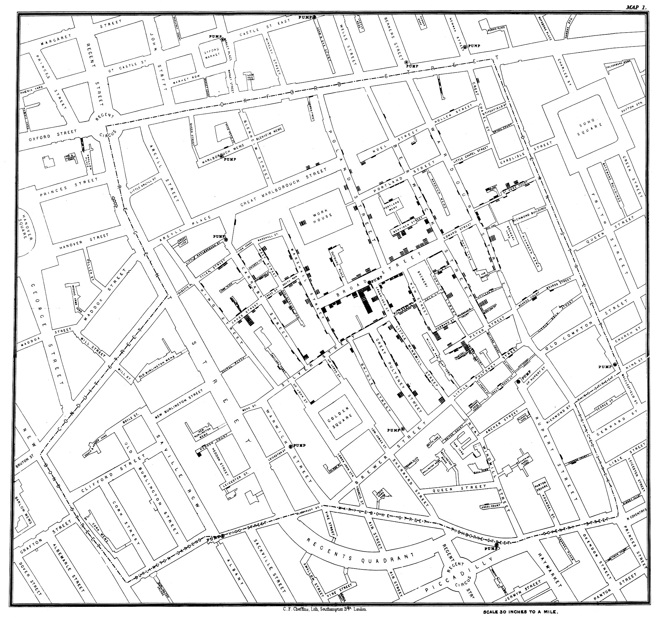
A simplistic but rather impactful visualisation of the water pumps in London associated with transmission of cholera paved the way for root cause identification. Medical doctor John Snow collected data on cholera deaths and created a visualisation where the number of deaths was represented by the height of a bar at the corresponding address in London. This visualisation showed that the deaths clustered around Broad Street, which helped identify the cause of the cholera transmission, the Broad Street water pump (Snow 1854; Wikipedia contributors 2023).
An early complex visualisation was created by Minard in 1861, depicting data from Napoleon’s march on Moscow in 1812/13 and his subsequent retreat.

The map shows latitude and longitude of the army as it moved. The line shows the direction of movement, and the line width represents the size of the army (the surviving soldiers). Particular locations were marked by the date of the army presence, and the temperature is shown, too. Six variables were elegantly woven into a single display (Tufte 2001; Corbett 2001; Robinson 1967).
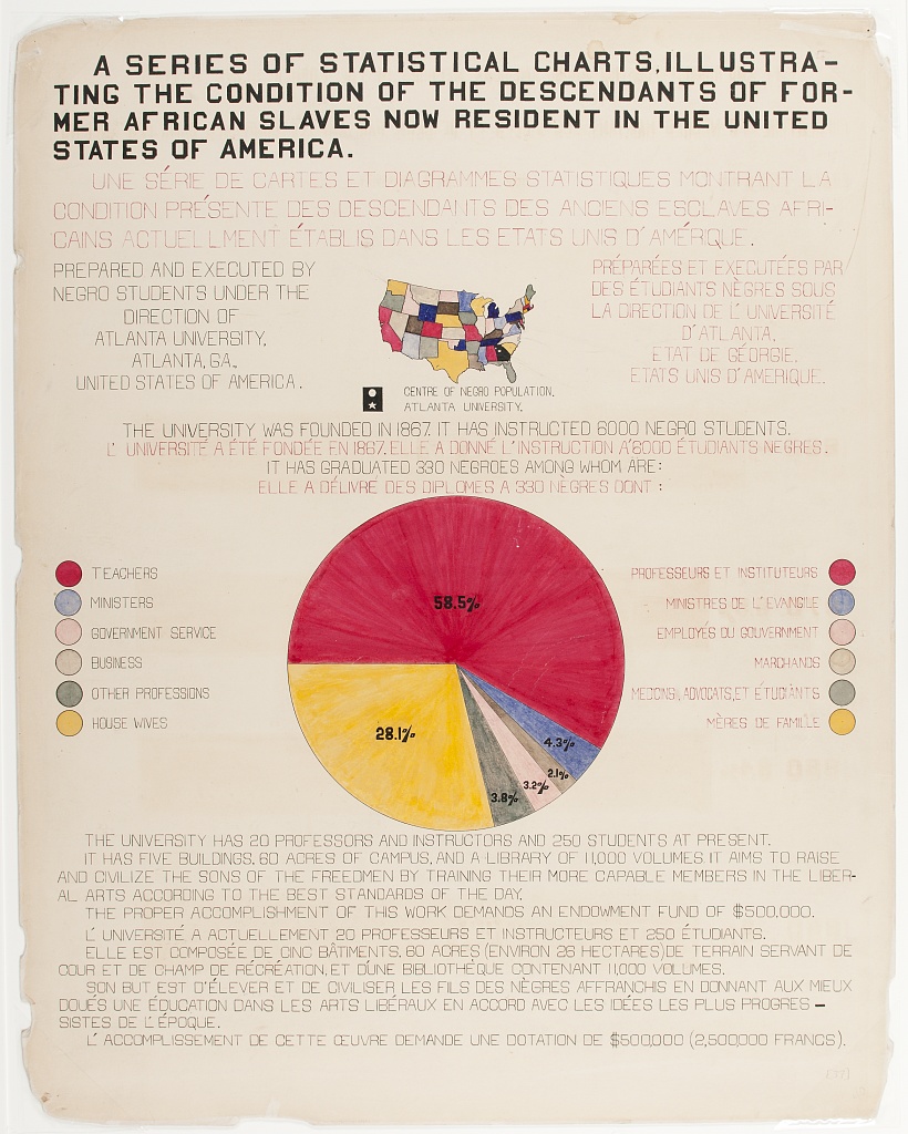
The Paris Exposition in 1900 featured W. E. B. Du Bois exhibiting graphs, charts, and maps of how Black Americans were living (Du Bois 1900; Battle-Baptiste and Rusert 2018).
Groundbreaking work in modern visualisation was provided by Tukey with his book Exploratory Data Analysis (Tukey 1977), and Edward Tufte (Tufte 1990, 2004, 2006).
The historical development of visualisations is provided in various publications by Michael Friendly (Friendly and Denis 2005; Friendly 2018, 2022).
Data were visualised by hand until computers came along. The first monitors and printers worked in text mode only, with a resolution of 25 rows and 80 columns or similar, which did not permit much detail or precision. Graphics terminals and dot matrix printers followed, and resolutions kept increasing with the development of laser printers.
Statistical systems such as SAS enabled creation of data visualisations early on (“Documentation” n.d.).
Arguably the most consistent implementation of a graphics system was realised with ggplot (Wickham 2011, 2016) based on Wilkinson’s The Grammar of Graphics (Wilkinson 2005).
A key component of ggplot2 is the feature of creating conditional displays. These allow for subsetting the data by the values of one or more variables. The concept was introduced by Cleveland (Cleveland 1993, 1994), showcasing a widely known barley data set that was analysed in textbooks for decades until a visualisation strongly suggested an error in the data set – two years of crop yield of one variety at one of six farms were accidentally swapped. It took a visualisation to reveal what numerous numerical analyses had missed!
Cleveland named the display type “trellis”, being inspired by a trellis in his garden (Cleveland 1993). The trellis concept was first implemented in S (Becker and Chambers 1984) and S-PLUS (Becker and Cleveland 1996). When R (R Core Team 2021) was developed by Robert Gentleman and Ross Ihaka in Auckland NZ in the 1980s, a package named lattice was developed (Sarkar 2008) since “trellis” carried a trademark (by Lucent and later MathSoft). With the advent of ggplot, the term faceting (with functions facet_grid and facet_wrap) replaced the “lattice” with its “panels”.